A major update to PreSonus’s cross–platform DAW sees Studio One take some popular feature concepts to new levels.
PreSonus have never been a company for low–key announcements, and true to form, Studio One 3 comes with the tag line “The Next Standard in Songwriting and Production”. With the huge range of software music-production tools available, it’s hard to know what the current standard is, but it’s good to know that we’re all going to be using Studio One “next”!
Amongst the key new features in version 3 are an Arranger track for song creation and rearrangement, a Scratchpad where you can try out new arrangement ideas, and a touch–friendly interface that takes advantage of multi–touch screens. PreSonus have revitalised the included plug–ins and instruments, and created new ways of combining them into super ‘multi–instruments’. They’ve also been listening to their user community, and have introduced the long–awaited automation curves and a bit of welcome MIDI processing. Do be aware, though, that the majority of the new features are available only in the Professional edition, which is what we’re reviewing here. Studio One Prime and Artist users have to make do with a refreshed interface and a couple of other bits and bobs unless they want to make use of the integrated shop to add more features or content. But have PreSonus ticked enough boxes to tempt users of other DAWs into their slick recording environment?
Activation Stations
At 90MB, the Studio One installer is surprisingly small. However, behind that there’s over 30GB of content which can only be installed by download, even if you buy a boxed copy! I always thought that the benefit of the boxed copy was that you got the entire product in the box, but sadly, all you get is a download code. For an extra £20$29.95, you can order a version with a USB thumb drive containing all the content, but if you don’t fancy that, then Studio One’s content is going to clog up your Internet connection for some time. I miss optical data discs!
There’s no subscription–style payment option, as has become the fashion lately, so you have to come up with the full amount at the time of purchase. There’s also no copy–protection dongle, which will be a relief to many, and PreSonus allow you a generous five activations on a single licence, so you can have it installed on your desktop at work, at home and on your laptop without worrying about losing or breaking a little USB key.
Healthy Economy
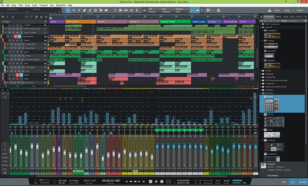
The single–window approach of previous versions is still evident in Studio One 3, but the re–skinning is sumptuously modern and flat, and makes version 2 appear oddly shabby and strange in comparison. The layout mirrors Sonar’s Skylight interface with the arrange window in the middle, the browser on the right and the mixer/console/editor at the bottom. Unlike Cakewalk, however, PreSonus have implemented this layout without it feeling crowded or complex. Scalability and support for high–DPI screens means it can look just as good on a large high–definition desktop screen as it can on a laptop or tablet.
The colour palette follows PreSonus’s love of muted blue, silver and deep greys, almost to the point of being a bit dull, but you have a lot of control over the hue and luminance of the background and arrangement windows to spice it up a bit. Compared with the colour cacophony of Pro Tools, the many windows of Cubase and the busy–ness of Sonar, Studio One exudes cleanliness and sobriety. If you installed a Calm button in every other DAW, this is what it would look like once pressed! It’s not that it lacks information or available functionality: it’s just that the noise has been beautifully designed away. Track information is a good example. Track headers contain the barest minimum of information — mute, solo, record enable, monitor and I/O assignments — and yet it’s no more or less than you need the majority of the time. Click the ‘I’ button at the top, and it calmly reveals the familiar inspector panel on the left, with all the information and parameters you could wish for — but you’re not encouraged to leave that open, and so the minimalist look is maintained. With a couple of well–placed hide/reveal buttons Studio One is able to keep everything accessible and yet fully under control.
The functionality of the arrange page has remained largely the same, with all the usual tools available to move, cut, splice, merge and manipulate chunks of audio and MIDI. One innovation, however, is that the right–click toolbar has been replaced with a comprehensive menu of editing operations, and instead, you can switch to an alternate tool mode, Logic–style, by holding the Ctrl key. For instance, you might have the arrow tool selected normally, with the split tool nominated as the alternative so it’s instantly available when you hold Ctrl. If you rely mainly on a couple of tools, it makes for very swift editing, although I imagine some Pro Tools users might be crying out for some sort of smart tool that offers up different functions depending on where you hover the mouse.
Automation has had a small tweak with the introduction of nodes between automation points to allow for the easy creation of curves. Automation now features single– or double–curve nodes. Clicking and dragging these creates a simple single curve, while Alt–dragging generates a double curve. Automation is still continuous, there’s no form of automation clip or region system and it completely disappears when you hide the lanes, with not even a hint of it displayed on the track itself. You can use a separate automation track, which keeps it visible, but that seems to disconnect it from any edits and movements you make to regions on the source audio track, which is not always what you want.
Making Arrangements
Building on the Blocks concept in Reason and taking more than just the name of the Arranger track from Cubase, Studio One’s Arranger track evolves this songwriting tool into something uniquely immediate and integrated. On the surface it looks like an enhanced marker track where you label up the various parts of your song as verse, chorus, middle eight, break and so on, but these sections have an impact directly upon the tracks in the arrange window. In Reason you’re putting a number of bars inside a block and then arranging the blocks to form songs; in Cubase the sections allow you to create a playlist so that you can vary the order and repetition of the song parts. In Studio One 3, the sections hook directly into the tracks and allow you to move, copy, paste and duplicate an entire section right in the arrange page. This is done without you having to tidy up the parts or ensure everything is cut correctly; as soon as you grab a section in the Arrange track, it automatically cuts the section from all the tracks, allowing you to rearrange the elements of your song with a simple and efficient drag and drop gesture.
The Arranger track also has an inspector panel which lists the current order of sections, a bit like Cubase’s Arranger Event List, and you can perform all your rearranging directly within that list. It’s remarkable to watch your tracks get cut to pieces while you’re moving sections about. It feels very destructive, which it is, and can leave you wondering how you are going to get your original song back together, which is where one of PreSonus’s biggest innovations comes in.
Scratch That Itch
Studio One doesn’t want you to get in a mess: it wants you to experiment fearlessly, and provides the playgrounds in which to do so. PreSonus call these Scratch Pads and they really are very useful. It’s one of those ideas that makes you wonder why we haven’t always had it!
 The Scratch Pad is a brilliant innovation for experimenting and reworking arrangements.The basic concept is that a Scratch Pad is a second (or third or fourth...) arrange page where you can chop your song about without affecting your original arrangement. You may have done something similar in the past by copying large chunks of your project further up the timeline, or by saving multiple copies of your project so you can work out different ideas. This is so much better than either of those methods. You can create a new Scratch Pad by clicking the button in the toolbar, right–clicking an arranger track section, or using the ‘+’ button in the Arranger inspector. The Scratch Pad then appears in the right side and is separated from the main arrange window by a divider.
The Scratch Pad window is identical to the arrange window but without the track list: that remains the same, as this is not a new project, merely a new arrangement. As you drag the divider from right to left, it doesn’t squash or resize the arrange page, but runs over the top, like drawing a curtain. You can move or copy across any clips or regions with a drag of the mouse, or you can create totally new stuff within it. You can record, edit and rearrange in a Scratch Pad in the exact same way you would in the main arrange page. You can have as many Scratch Pads as you like in one project, and copy and paste things from one to another, but you can only view one at a time.
Scratch Pads have a special relationship with the Arranger track, which enables you to keep any messiness under control. Selecting one or more Arranger sections and right–clicking gives you the option to copy or move those sections to a new Scratch Pad. You can also drop sections onto new or existing Scratch Pads in the Arrange inspector. This enables some simply brilliant things. You could pull out a verse, work on elements inside that section, then drop it back into the main song. You could copy your entire song to a Scratch Pad, do a complete rearrangement and compare it with the unaffected original. You could pull a bunch of loops out of an existing song and drop them onto a Scratch Pad to create a remix. You can create Scratch Pads from Scratch Pads and insert, duplicate or replace sections back into the main window. It’s a wonderfully elegant and creative, production–changing feature that no other DAW has. The only limitation I can see is that it’s all tied to the same track list and console, so mixer settings and effects will be the same whatever arrange or scratch window you are using. By design, this is normally a good thing, but there’s no option for creating separate mixer scenes or settings for each arrangement, which might be very useful if your Scratch Pad ideas start turning into something bigger.
Better Browsing
The browser is one of the defining features of Studio One. It’s where all the dragging and dropping of samples, effects and presets originates, and it’s good to see it being worked on and improved despite its unglamorous nature. For me, the most significant change is the consolidation of the tabs and menus to the top of the browser. It would drive me crazy having to swap my attention from the top to the bottom trying to get the browser to display what I was interested in, so top marks for making my life easier and changing something that probably never should have been that way in the first place.
The browser now has a new section for loops, and provides a few more ways of sorting and categorising them for easy searching. Previously you could search only by name, but now all the core sounds and included loops are tagged with a style, character and instrument type. This is also true of any content purchased through the very handy PreSonus shop. In–app purchasing is becoming a bit of a thing in DAW software, and PreSonus have added a Cloud tab through which you can buy new plug–ins, effects, sound libraries and more. At the time of writing there are 21 available items: 18 are sound libraries, two are feature extensions and one is an add–on for the Ampire guitar plug–in. The shop doesn’t hide things you already have, but the ‘buy’ button on any such items is greyed out. It turns out that there’s only actually five items that owners of Studio One Professional v3 can buy, all of them sound libraries, so at the moment the shop shelves are a little bit bare. Below the shop, the PreSonus Exchange lets users share templates, presets, effects chains and all sorts, and beneath that is a SoundCloud section where you can drag files directly from your SoundCloud account into your projects.
The general layout of the browser has been greatly improved: it feels easier to use and less cluttered, and I’m finding the things I need much quicker. Perhaps the thing that contributes to this the most is the lovely plug–in thumbnails. The ability to create thumbnails for all your plug–ins makes them easy to locate in the new–look browser. I first saw this in FL Studio, which suffered from having a similarly cluttered browser window, and it’s an awesome feature to appropriate for Studio One. What it means is that instead of a long text list of instruments and effect plug–ins, you get a nice list of thumbnail images of their GUIs. As you scroll, the thumbnails give you a visual reminder of what the plug–in does, making choosing the right one much easier. It’s only the PreSonus plug–ins that have thumbnails initially, but you can create thumbnails for any third–party VST plug–ins simply by loading the effect or instrument and choosing Update Plug–in Thumbnail. Studio One takes a screenshot of that plug–in in its current state and sticks a thumbnail into the browser, making it a far more attractive place.
VST Instruments
PreSonus have added a new subtractive waveform synthesizer called Mai Tai, and have updated their Presence sample player to become Presence XT. Both use PreSonus’s new instrument engine which emerges as a standardisation in sound shaping, effects and modulation. So in both instruments you’ll find the same filters, LFO and envelopes (two in Presence XT, three in Mai Tai) along with the same modulation matrix and effects section. Both have large friendly GUIs, making them fabulous for touch control, and you can touch as many knobs and controls as you like simultaneously. The editor windows float, so if you have a second screen with touch technology then you can pull them onto it. You can run the two side–by–side on a 1920x1080 screen with just a touch of overlap and use one hand on each — who needs an iPad app?
Presence XT comes with 15GB of content (less in the Artist and Prime versions) which amounts to about half of the massive installation download. The library covers all the expected acoustic and electric instrument sounds, orchestral instruments, guitar, pianos and some sampled synths: nothing out of the ordinary, but it does give you a good solid range of useful sounds. There’s a folder of presets called Artist Instruments which contains a lot of interesting and more exotic single sampled sounds. Users of the previous version will be happy to know that Presence XT contains all of its sounds as well, so projects that use Presence will open as expected. Some of the instruments include articulations which are triggered via bottom–octave key switches, marked in red. A really helpful touch is that the name of the articulation appears when you hover your mouse over the key. The articulation keyswitches also appear in the piano roll, and if you switch to drum view, they are even labelled for you.
Some other voices come with additional controls in the form of a control script. There’s no real information anywhere on what these scripts are, but the result is that some extra dials appear in the otherwise blank screen in the middle. As an example the Acoustic Piano has some controls over mechanical noise and the velocity curve, while on an Organ sound they act like drawbars and on the Les Paul you can dial in likelihood and volume of fret noise. However, sounds that use either articulations or scripting are few and far between at present, so these deeply creative features seem a little underused.
Fun With Formats
Presence XT allows sounds in EXS, Giga, Kontakt and SoundFont formats to be directly loaded without any need for conversion. I found that my old Giga libraries loaded impressively quickly, the only drawback being that Presence ignored any articulations, so my beloved Advanced Orchestra instruments were all being loaded with the most aggressive articulation: fast tremolos, overblown brass and squeaking woodwinds. Interestingly, if I first loaded the Giga files into Kontakt and converted them, then the resulting Kontakt instruments loaded perfectly with all the articulations intact. Presence wouldn’t load up any of Native Instruments Komplete library, or third–party Kontakt libraries such as Rev or Signal from Output. However, some Kontakt libraries — those that weren’t tied directly into the Kontakt instrument file system — would load fine. You can’t, however, load individual samples, and there’s no facility for creating your own sample–based instruments.
Once you’ve stopped fiddling around with the library, Presence XT sounds and plays beautifully. The LFOs, filter and the one unassigned envelope leave masses of room for creative tweaking. The modulation matrix is something of a strange beast. It offers 16 slots, split into in two banks, where you can assign any input device or modulator to control a bunch of the synth engine parameters. You can combine modulators, so that both an LFO and the mod wheel can affect the same thing, or you can have one LFO control the frequency of another and then let the second LFO control the filter cutoff. It’s enormously powerful, enabling you to create complete sonic chaos very quickly, but I was not always sure whether what I was doing was having the desired effect. What would help would be if the controls on the GUI showed what was happening to them. If the LFO is controlling the filter cutoff, I want to see the filter knob move to reflect that, but sadly you have to rely on your ears alone.  The new Presence XT sample–playback instrument and Mai Tai virtual analogue synth share many design features.
Unique to Mai Tai, meanwhile, are two oscillators with sub–oscillator and noise generator, an additional assignable envelope and a very interesting Character section; in other respects, the controls, effects and modulation matrix are the same as in Presence XT. As all the controls are present on screen, it’s easy to edit and see what’s going on, with the exception perhaps of the modulation matrix. On many synths, assigning the LFO to something is as easy as flicking a switch or turning a dial, but here, you have to set up a routing in the matrix, which is powerful but perhaps a little over–complex for some of the simpler or more obvious functions.
It’s not overflowing with presets but there’s a good selection, categorised under titles such as Bass, Lead, Pad, Poly and Strings, and overall the sound feels deep, wide and lush in all the right places. Perhaps more interesting is the Templates folder which contains a bunch of basic starting points. You can load an ‘init’ patch and start with a single oscillator, but these templates give you a helpful push along the road to sound creation. There’s a template called ‘EasySaw’ and another called ‘HyperSaw’, there are ones with effects such as tremolo and vibrato already loaded, and others with filters tuned ready to go: it’s a really useful palette of basic sounds for playing with synthesis, though when you start from a template, things get loud very quickly and can overload your outputs. The sonic possibilities are pleasingly vast and the built–in effects give it another sound–bending dimension, the Gater and EQ being particularly satisfying.
Note FX
Many users of Studio One have requested MIDI plug–in support, and PreSonus have answered this with Note FX: a collection of four different MIDI plug–ins which can be dragged from the Instruments tab onto any MIDI track. The Arpeggiator is particularly fully featured, as along with the usual up/down/random modes it also has a pattern mode where it becomes a step sequencer with up to 32 steps; as well as varying the level, you can also change the gate time from 0–200 percent and so have notes overlapping and flowing into each other.  Arpeggiator, Chorder, Repeater and Input Filter are your Note FX gang.
Next up we have a Chorder plug-in, which allows you to trigger chords from a single note. There’s a great selection of presets covering all the usual chord types and it’s dead easy to create your own by pressing the Learn Mode button and clicking on the notes you want included. The Input Filter used to reside in the inspector panel but has now become a Note FX with its own interface, perhaps just to fill the selection out a bit. Finally, Repeater, which is a great little MIDI echo tool with the ability to create amazingly complex patterns. It’s very similar to the Arpeggiator with its 32 steps and gating options, and gives you the ability to set the pitch of each note in the pattern, so with a single key strike you can produce an intricate 32–note delay. Once Note FX have been loaded onto an instrument track you’ll find them hiding in the inspector panel for the instrument, where you can also add them directly.
Multi–tasking
Wouldn’t it be nice to be able to combine all these new instruments and MIDI plug–ins into some kind of complex routing and sound–mangling environment? Enter the Multi–Instrument, PreSonus’s new instrument–combining and sound–mangling environment. Put very simply, it’s a plug–in where you can host different instruments and MIDI effects together as a single instrument. It’s not a spectacularly new idea — stand–alone VST host programs such as Forte and Cantabile have been around for years and you’ll find similar ideas in Reason’s Combinator and FL Studio’s Patcher — but as with many of PreSonus’s borrowings, they have implemented it with wonderful elegance and a deep level of integration.
You can add instruments to a blank Multi–Instrument page from a drop–down list or drag them in from the browser and they appear next to each other, all connected to the same input. You can line up as many as you wish, or you can use the Splitter tool to branch off into increasingly complex subsets. Each instrument has its own layer across the keyboard at the bottom of the window, and you can resize either end of a layer to map the instruments across a range of keys. This means you can combine certain sounds in certain areas of the keyboard, making the Multi–Instrument quite a powerful performance tool. You can drag Note FX modules onto each or all of the instruments, or with clever use of the Splitter tool, apply them to just a couple.  The new Multi–Instruments let you combine instrument and Note FX plug–ins to form complex layered and split creations.
Each Multi–Instrument has an inspector panel which includes the channel strip that’s also present in the Mixing Console. This allows you to mix and add audio effects to the audio signal of that instrument. The clever bit is that these settings, although just a mirror of the console, can be saved with the Multi–Instrument as a preset. This means you could create single–instrument variations with a whole load of audio effects already loaded. The inspector also shows the parameters of any Note FX plug–ins so you don’t have to bring up the full GUI to tweak a setting.
Macro Bionic
Overlaid on top of a Multi–Instrument is a panel of Macro Control knobs. These can be assigned to control any of the parameters within any loaded instrument or Note FX, as well as the channel strips or inserted audio effects. In the Macro mapping page you can drag parameters across to the knobs and buttons, or you group them in the middle, to assign a number of parameters to a single control. There’s one more thoughtful setting, called Transition, which dictates how the plug–in parameter responds to the movement of the macro control. With a steep Transition curve, for instance, a small movement of the macro knob would cause the plug–in knob to move nearly all the way round.
The Macro Controls consists of eight knobs, eight buttons and a pair of X-Y pads. Together, these give you the ability to construct a custom interface for your instruments, albeit a relatively modest one. There’s one more factor that elevates the usefulness of the Macro Controls, and that’s that they are all multi–touchable, so if you have a suitable touchscreen, you can get your fingers on the X-Y pads and the knobs and simultaneously fiddle to your heart’s content. The consequence of this in a touch environment is that you could create multi–touchable interfaces for non–touchable plug–in instruments.  A Multi–Instrument’s Macro Controls can be assigned to any of the parameters for any loaded instrument.
The ease with which you can put together instruments and make them controllable, and the way it’s so tightly integrated into the Mixing Console, make this an awesome tool for sound and instrument creation. If I was trying to dig out a criticism it would be that the Macro knobs don’t show you what instrument within the Multi–Instrument they’re controlling. If these were to change to the colour of the instrument, which is also shown in the keyboard layering, then that may help — although if you’ve combined controls from several instruments to a single Macro knob then I guess that wouldn’t work, unless you somehow added all the colours. The only other thing that could improve it would be to allow audio effects to be dropped into the routing environment. In FL Studio, the Patcher shows MIDI data going in one side of each synth and audio data out the other, allowing you to drop audio effects into the path and combine and effect audio outputs from the various synths. You can set that up in Studio One’s Console with buses and so on, but keeping it in the same environment would be very cool.
Console Yourself
Talking of the Console, Studio One’s mixing environment has gone through a fairly radical evolution. It looks restrained and unassuming until you find the top edge with your mouse and drag upwards, whereupon the faders and metering grow organically until they stretch to the entire height of the screen, resolutely fixed at the bottom and eternally expanding at the top. If you have two screens configured like mine — stacked one above the other rather than the more common side by side — you can have faders with a 550mm throw (I measured it with a tape measure). Reed Richards–style stretching aside, one of the most–requested features was resizable faders, and I think it’s fair to say that PreSonus have nailed that one.
The Console has a couple of different view modes. Wide and Narrow change the breadth of each channel strip by a factor of two, while Small and Large refer to the placement of the insert and send device racks. In Large mode, these appear fixed at the top of the channel in a the traditional way — the fader section and insert section can be resized independently, which is very nice indeed. In Small mode, double–clicking space on the channel or clicking the little ‘expand’ arrow makes the racks appear on the right of the channel, like the Pro Channel modules in the Sonar console. or wide (above) modes.") Studio One’s Console can be viewed in narrow (top) or wide (above) modes.
Studio One’s Console can be viewed in narrow (top) or wide (above) modes.
The organisation of the channels has been improved. Each channel is hard–wired to the relevant track in the arrange page, and vice versa, and so each selects the other when clicked. This enhances the flow between the two views and removes the need to have a fader in an inspector channel. A small spanner on the left of the mixer reveals a small menu of key significance. A couple of tick boxes dictate whether effects and send channels remain dotted about the mixer where you created them, or whether they should be grouped together all the way to the right. This helps a lot in keeping track of things when your projects start to expand, as do the blue caps on the effects and send faders. Another box links the folder contents show/hide button to the mixer so that folder channels are only visible when the folder is open on the arrange page — very neat. Lastly, a colourise button mutedly matches the colour of each channel to its respective track or group.
PreSonus appear to have worked hard on helping us organise and find our way around the console without getting lost in a field of silver and grey, and their efforts have certainly paid off. Another nice touch is a Trash button which reveals a helpful panel that lists recently deleted plug–ins, allowing you to restore them back in place; two more buttons bring up panels for external and internal instruments, so you can see what’s loaded and what outputs are enabled. Lastly, the Channel List lets you show or hide each channel, group or type of track, so you can focus only on the channels you want to see. You can save individual setups as ‘scenes’ and so quickly swap between them. It should be noted that all this does is hide the channels in the mixer — if you have them linked, it also hides the tracks in the arrange page, but it doesn’t delete or disable them, so they still play back.
As the faders are stretched, so are the meters that run alongside. Peak meters are found on every channel except for the main and sub outputs which feature Peak/RMS meters, and can also show loudness levels according to Bob Katz’s K–System. In addition to the level metering on each channel you’ll also find a Pro Tools–style gain–reduction meter which displays the combined effects of any dynamics plug–ins inserted in the rack. This currently only works with PreSonus plug–ins but it’s a remarkably helpful indication to have on your console.
Return Of The Macros
This brings us to the insert racks and the new Channel Editor. I’ve always liked the effects chain presets in Studio One, which let you save and load settings for a bunch of plug–ins in one go. These are still available in version 3 and can be accessed from the drop–down menu in the insert rack, or dragged from the browser.
There doesn’t appear to be a limit to the number of inserts you can drop into the rack, and each one can expand to show a couple of slidable parameters within that space: the Pro EQ, for instance, shows a tiny graphical version of itself which is fully editable. Obviously you can view the full GUI editor for each plug–in by simply double–clicking it. Studio One really doesn’t want you to have more than one plug–in window open at a time, so each time you open a new one, its editor directly replaces the current open editor. Similarly, as you move between channels the editor window changes to the plug–in inserted in the channel you’ve selected. This is very tidy and efficient, although it can get a little annoying when you want to compare two plug–ins — thankfully, a little pin button will allow you to keep the current editor open and on top so you can open another alongside.
When you edit an inserted plug–in, it now opens within the new Channel Editor. This is a misleading name because it only really deals with the inserts, but what it does do is very interesting indeed. If we ignore the inserts for the moment, you can open the Channel Editor from the bottom button on the channel strip, next to the fader. What appears is the same sombre row of eight dark grey Macro Control knobs that we find with the Multi–Instrument. To their left is a squat version of the channel strip, and beneath lie some buttons and empty labels. There’s also a down arrow which expands the editor further to reveal two X-Y pads. If any inserts are loaded, they appear in tabs across the top, and you can access the controls for each by clicking on it.  The new Channel Editor makes it a doddle to set up, store and recall complex parallel processing chains.
So far, so functional: but the interesting button is the space–invader one labelled Routing. This opens up an effects chaining and splitting environment very similar to the Multi–Instrument, where a mind–boggling array of creative things can happen. It displays your loaded insert effects in a vertical chain, to which you can add further plug–ins from the drop–down menu or by dragging them, either from the browser or from insert slots on other channels.
The fun begins when you add a splitter. Drop it into the chain and it splits the signal and routes half through each of the next two plug–ins. Each splitter can divide the signal into up to five branches, each with a plug–in or chain of plug–ins, and if that’s not sufficient, you can add further splitters to create a massive array of parallel plug–ins. What’s more, the splitter can perform left/right channel splits or frequency–based splits as well as simply multing the input. You want to process the high frequencies of a guitar track differently from the lower frequencies, while leaving the mids alone? The splitter makes this an absolute doddle. Perhaps the only thing the splitter lacks is gain controls to adjust the level of each branch, or maybe a balance knob to change how much goes down each route.
The Macro Controls behave in the same way as those in the Multi–Instrument. The eight grey knobs, the X-Y pads and the eight buttons can all be assigned to any control of any of the inserted effects. Hitting the little spanner icon opens up the mapping. On the right you have a list of the loaded plug–ins and their parameters, on the left is a list of the Macro Controls, and in the middle, you can link and combine parameters from the plug–ins to the macros. You can have one knob control the whole lot if you wish!
There are some restrictions, in that there’s only one Channel Editor per channel, so you couldn’t create one for each plug–in and then insert them all into the same channel. You also can’t customise the layout, expand it or colourise it. It’s totally touchable — which, again, allows you to build a touchable interface for non–touch plug–ins — but perhaps that would be more useful if the Channel Editor was itself available as a plug–in.
A Touch Of Class?
As detailed in my article on multi–touch in SOS November 2014, the adoption of multi–touch by the major DAW manufacturers has been somewhat glacial, but this is at last beginning to change. Most DAWs support single–touch control, although as this isn’t simply mouse emulation, how well it works can vary enormously. Cakewalk’s Sonar was first to implement support for multi–touch — this is using two or more fingers on a touchscreen — and the recently released FL Studio 12 takes multi–touch integration a lot further.
PreSonus market multi–touch as one of Studio One’s top three new key features, but there’s no documentation on what is and is not touch–compatible, and the only mention in the manual takes you to an enable/disable setting that doesn’t exist. However, through trial and error I discovered that the arrange page, browser, editor and mixer all have touchable features. The initial release had quite a bit of unexpected instability in the touch department: selecting channels was awfully slow, adding notes in the editor would create weird ghost notes and then lock up, or you’d just encounter weird behaviour. In fact, I couldn’t really use Studio One 3 on the Surface Pro 3 without it crashing. However, just before I’d finished this review, PreSonus released version 3.01, which improves on most of the issues and rescues it from being a bit of a damp squib. The issues with the Surface Pro 3 have not been fully resolved (see box) but they have improved immensely.
The mixing console is probably the best place to start as it lends itself most naturally to touch, and it behaves beautifully. Everything works as expected: faders and pan controls are smooth and responsive, and all the buttons are just fingertip perfect at regular scaling, with only the inserts arrow perhaps being a tad on the small side. The single–finger scrolling motion that moves through the channels is very nice, with some pleasing inertia, and the clarity of the channel strip is enormously helpful. There’s still some delay when selecting channels, so that it’s now instant to select one but you have to pause briefly before you can select another. If you tap and hold, which is the same action you would normally use for a touch right–click, you’re able to move and rearrange strips after a moment. All the included plug–ins are multi–touch throughout, and work consistently, with knobs responding to a forward and back motion. Working with the more visual plug–ins such as the Pro EQ becomes so easy with touch. Studio One’s multi–dynamics plug–in has always been joyfully visual to use, and the ability to get my fingers in there really appeals to my creative side.
If you are using a separate touchscreen, the ability to detach the mixer from the main window is ideal, keeping everything you need to control in the right place. I find this much neater than having to drag the program window across two or more screens in order to display content, although you can also do this if you prefer.
Dragging and dropping from the browser is vastly improved in the 3.01 update, so now you can confidently finger a thumbnail and drag it where you please. You can’t, however, seem to drag plug–ins between channels as you can with a mouse: no amount of tapping or holding would make that happen. The splitter in the Channel Settings also didn’t like doing more than one thing at a time, and there were occasions where Studio One would get confused, throw up errors or stutter to a stop. The Macro Controls, on the other hand, are wonderful and work exactly as you would expect them to. It’s a similar experience with the Multi–Instrument, where the Macro Controls are superbly responsive to touch, but the splitter environment is just a little bit flaky.
On Hold
Moving to the arrange window, we get pinch–to–zoom gestures in both directions, and single–finger scrolling left and right. Selecting tracks suffers from the same kind of delay that you find selecting channels in the Console, particularly when you tap in the arrange part rather than the track label, but as long as you take things easy, it does the job.
Up until this point the implementation has, more or less, matched Sonar’s, but here Studio One takes a leap forward, allowing direct finger editing on regions and tracks. Touch editing works by using the same tap–and–hold gesture used to move tracks in the Console. A square appears to show you that you’ve captured the region you’re tapping on, after which you can move it or create a selection depending on which tool you’ve chosen. The tap–and–hold gesture is required to resize the region, change the fade-in/out or the gain. When it comes to slicing or deleting, you can simply tap once and then, after a pause, the cut or deletion is made. Double tap to open the audio editor, which works in the same way. In the piano–roll editor, meanwhile, you can double tap to enter notes and it happens immediately like you’d expect it to; if you select the pen tool, on the other hand, you can tap once to add notes, but they don’t appear until after a pause. To edit or move a note you again have to tap and hold.
I confess that, in practice, I found PreSonus’s implementation of touch editing frustrating, and soon ended up reaching for the mouse. The problem is that the use of tap–and–hold slows your workflow to a crawl. I’m guessing that if you could simply grab regions or notes with your finger, like you do the mouse, then it would interfere with the single–finger sideways scrolling. But why does single–finger scrolling get precedence over ease of editing? In many other bits of multi–touch software, two–finger scrolling is totally normal, and releases the single finger for more important editing duties. PreSonus’s decision to assign ‘left–click’ features to the ‘right–click’ tap–and–hold also removes the ability to use the right–click gesture for right–click things. For instance, if you could move regions with a tap, you could then tap and hold to cut them.
This multi–touch implementation becomes particularly cumbersome when editing automation — something that can be done with a swipe in many non–touch DAWs such as Cubase and Pro Tools. In Studio One, you have to tap and hold and wait for the node to get captured by your finger. You also have to tap and hold before you can move floating windows, such as plug–in GUIs — yet with any other window in Windows 8, including the entire Studio One window, you just tap and drag. What makes it even more odd is that you can resize the window at the edges or corners with just a touch and drag. I admit to being totally baffled. Touch is at its most useful when it enhances productivity or makes a task more efficient. It has the potential to do this because it’s not constrained by a linear input function like the mouse. But if it slows you down, even when enabling you to be creative in a different way, then you’ll start to ignore it and reach for the mouse.
However, the implementation of touch in the Console, Macro Controls and synth and effects plug–ins is excellent and a joy to use and in of itself makes a touchscreen a decent and intuitive companion to Studio One. The touch in the arrange page and editors is solid and usable, it’s just slow, which is a shame.
There’s one saving grace on the touch-editing side which Presonus have got exactly right — although probably inadvertently! — and that’s the Macro Toolbar. This was introduced in version 2 as an optional extension before they implemented touch, and is in essence a row of buttons that issue a single command or combination of commands. This means that if there’s a procedure you do quite often, you can assign a button to carry it out in one go, so you don’t have to root around in the menu system for a series of commands. That’s very useful for the keyboard and mouse user, but it’s revolutionary for the touch user. Performing simple tasks such as copy and paste can be a pain when using just touch, particularly where you’re having to tap-and-wait for the right-click action, or trying to finger small menus. The Macro Toolbar makes these simple and stunningly efficient. You’ll find this idea implemented in the Slate Raven touchscreen and Devil Technologies DTouch Pro Tools and Cubase touch overlay software, and it’s what transforms clumsy finger editing into something workable.
The Macro Toolbar buttons default to quite complex commands, but you can easily add simpler ones for touch such as cut, copy, paste, duplicate, loop selection, undo and so on. You can also detach the toolbar and float it wherever you want, including vertically over the browser. This is such a vital thing for a successful touch workflow, and Studio One is the first DAW I’ve seen that’s nailed this particular feature. It could do with being more flexible in terms of resizing and colour, although you can add small images as icons, and ideally I’d like to see an option to dock it into the Browser, but otherwise it’s a cause for touchy celebration.
To fully understand the usefulness of touch I’ll be making a video demonstrating the workflow to accompany this review. You’ll find it over at www.youtube.com/MoltenMusicTech.
Final Thoughts
Having now created and mixed music on Studio One, I get a sense of why it’s stealing so many users from other platforms. The workflow is so very easy that despite being a bit unfamiliar with it to start with, I was recording, editing and mixing very quickly indeed. I instantly employed the Arranger track and a Scratch Pad, I enjoyed having Melodyne available right in the track, I found the vocal processing presets a dream to use, and found plenty of usable goodies in the loop library. I went from a couple of imported vocal harmonies and piano to a reasonably finished pop track in an evening, which, for me, is nothing short of miraculous. And, although I know that DAWs don’t really sound any different from each other, it feels like it does.
The multi–touch features in the Console, the Macro Controls and the instruments are well implemented and very welcome for the small community of touchscreen users, and hopefully could tempt more people to give it a whirl. I’m baffled by the implementation of the touch–editing functions in the arrange and editor pages, but hopefully this will improve. DAWs have always borrowed features from each other as they evolve, and this is one of the reasons why we have such a strong range of music production software available to us. PreSonus have been adept at taking cool features from other DAWs and making them their own while they’ve played catch–up to the other big players, but version 3 takes them beyond that, and their own innovations give them the right to stand on their own. I wonder who’ll be first to come up with an alternative Scratch Pad? Is Studio One the next standard? I think it’s earnt the right to some of your time, so you should download the demo and decide for yourself. But for me, yep, this is the one.
Trouble With Tablets?
With its multi–touch credentials, hybrid laptops, Windows 8 tablets and the Microsoft Surface Pro 3 would seem to be awesome mobile options for Studio One. Unfortunately, the initial release of Studio One 3 was so unstable as to be almost impossible to use on the Surface Pro 3 — when you’ve been using an SP3 for a while you tend to reach out and touch things instinctively, even when you have a keyboard and mouse attached, and that would be enough to break Studio One.
With the 3.01 update, things have improved dramatically, but there are still some issues. To avoid the instabilities, the SP3 must be run at 100 percent scaling, which is the smallest setting, with High DPI enabled. This makes all the menus and smaller items such as browser folders very small indeed. Thankfully the Console and the plug–in GUIs are still all very fingerable, as are the arrange page and editors once you zoom in a bit. So overall, it’s slightly annoying, but functions beautifully — except when you bring in the digital pen. The SP3 pen is a very useful surrogate mouse for smaller items, menus and precise edits, but unfortunately, Studio One hates it. Within a couple of seconds it locks up and requires you force the SP3 into shutdown, which is not very tidy.
Most other Windows 8 touch devices do not have a pen and so should run fine, provided that a high–DPI screen is run at 100 percent. For some videos of Studio One running on the SP3 that I’ve made to accompany this review, please visit www.surfaceproaudio.com.
App Accompaniment
As if they hadn’t done enough already, PreSonus also offer a free iPad app for Studio One remote control. It features all the Console controls, effects and transport buttons, allowing you to wander around your studio while you mix, or control the transport while sat in front of the microphone. It’s a fabulous utility that looks and works great, and is the perfect companion to Studio One. It shows 32 channels of metering on screen at one time, along with song position, the Arranger track and 10 pages of command shortcuts. These are split into 10 tabs covering Transport, View, Console, Event, Edit, Automation, Audio, Instruments and Macros, each giving you a 16–button matrix full of useful commands such as show/hide, quantise, merge tracks, duplicate, cut/copy/paste, nudge and move events, audio processes and the ability to select instrument presets, along with macro functionality such as cut to a new track, increase/decrease volume, merge events, crop and copy to new layers. It’s a wonderfully useful bunch of commands to have at your fingertips as a companion to your mouse.
To Touch Or Not To Touch
PreSonus’s focus on enabling multi–touch has had inevitable consequences on the design of the GUI. To be touch–comfortable, buttons, controls and menus have to be bigger, and when you compare version 3 with version 2, some of those changes are fairly obvious. This has frustrated some users who have argued that enlarging the interface to accommodate touch is negatively and unnecessarily impacting on mouse and keyboard users — especially as OS X doesn’t currently support multi–touch.
Is it fair on mouse and keyboard users to subject them to a touch–friendly interface? Maybe not, and they have some valid concerns, although for me, the slightly larger design in version 3 is also much clearer and easier to navigate when using a mouse. Perhaps the answer lies in having an interface that scales, and if so, PreSonus would do well to check out the scaling in Ableton Live, StageLight and FL Studio 12 for some insight into how well that might work.
Mastering
The mastering features in Studio One have been a useful and unique element since the start, and even though I didn’t get on very well with the look and feel of the DAW side of version 1 or 2, I found the mastering side to be enormously usable, enabling me to add a level of ‘finishedness’ to projects that I hadn’t been able to attain on my own before. Other than following the same interface changes I can’t find any differences in version 3, and personally, I would appreciate it if they moved on from the overwhelming blueness in all the displays and metering!
Pros
- New look is gorgeous.
- Arrange track and Scratch Pads are great aids to composing and remixing.
- The Multi–Instrument, Channel Editor and Macro Controls provide very powerful ways to combine and control plug–in instruments and effects.
- Touch control in Console and Macros works well.
- Thumbnails in the browser make finding plug–ins easy.
Cons
- Touch in the arrange and editor windows can be slow.
- Poor compatibility with Surface Pro 3 digital pen.
- No media in the box.
- No mixer recall for Scratch Pads.
Summary
Version 3 sees Studio One making a major leap forward, with a very attractive new interface and some brilliant songwriting and mixing tools.
information
Studio One Prime free; Studio One Artist £69; Studio One Professional £279. Prices include VAT.
Source Distribution +44 (0)20 8962 5080
sales@sourcedistribution.co.uk
Studio One Prime free; Studio One Artist $99.95; Studio One Professional $399.95.
Presonus +1 225 216 7887


